
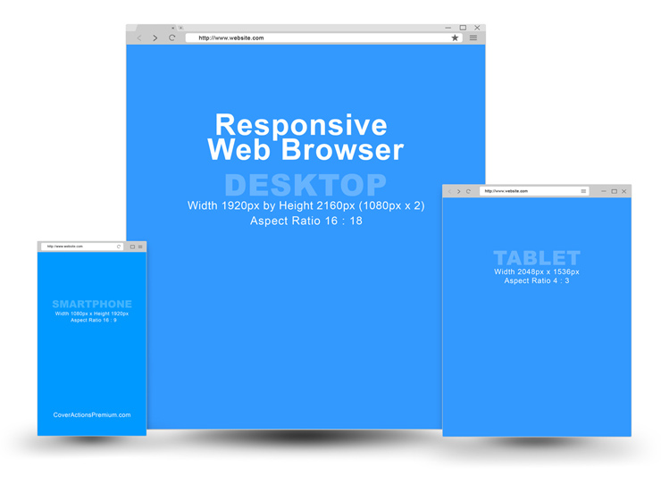
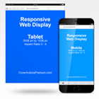
Showcase your responsive websites / blog themes design using this Photoshop action mockup set to create multiple responsive versions of flat simple browser for desktop PC, tablets and mobile in one shot display. I’ve made the desktop browser to twice as vertically longer than the standard 16:9 aspect ratio so you can at least display 2/3 of your website layout if not fully captured. Scrolling window capture software will be handy for this screen capture job. Tablets are 4:3 while smartphones are 16:9.
Responsive Web Browser Mockup Action Set end results (rendered using default starter template):


Cover Actions Requirement & Compatibility:
** ENGLISH Version Adobe Photoshop CS2, CS3, CS4, CS5, CS6, CC up to Photoshop 2026 pre-installed on Microsoft Windows OR Apple Mac OS.
Don’t have Photoshop? Get Your 7-Day Free Trial HERE
The Action script set final results rendered using provided pre-designed PSD template:


*** Member Downloads Area ***
Please login or register before start downloading.
These files are accessible for:
New member use below download link:

**These files are accessible only upon purchase of this products.
( Members must be logged in )
Become A Member
–SINGLE MOCKUP PURCHASE–


Similar Devices Screen Display Mockups:
 |
 |
 |
 |
 |
 |
 |
|
 |
 |
 |
 |
 |
 |
 |
 |
 |
 |
Browse More Devices Screenshot Variation Mock Ups
Related Posts
 Complete Learning Ecosystem Bundle Mockup
 Metal USB Flash Drive Mockup
 Kindle Mockup -with 5 x 8 Softcover Book
 Kindle Mockup -with 6 x 9 Softcover Book
 Kindle with 5.5×8.5 Softcover Book Mockup
 The Ultimate 3-in-1 Kindle & Book Mockup: Showcase Print & Digital Editions Instantly
 Kindle Mockup- With 5.5 x 8.5 Hardcover Book -v1
 eBook Reader Mockup -FREE
 8.5×11 Double Wire-O Report Book With Smartphone- Audio Book Mockup